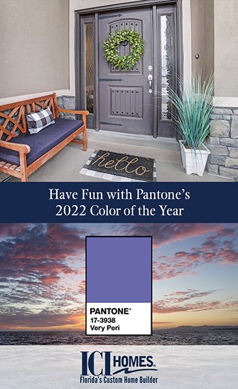
Need a decorative pick-me-up as you head deeper into the new year? We’ve got just the tonic — Pantone’s 2022 Color of the Year.
It’s a cheerful periwinkle blue called Very Peri that adds brightness and boldness wherever it goes.  Very Peri fits just about anywhere, especially in a new custom Florida home, and it’s a natural complement to the Sunshine State’s bright colors.
But Very Peri isn’t only for splashy accents. Its blue tones can wax serene in quieter areas of your home such as bedrooms and offices, and its blue-purple combination means it plays well with many classic shades, textures and materials that echo a Florida lifestyle.
Here are more suggestions on how to enjoy Very Peri.
Why is this significant?
The New Jersey-based Pantone Color Institute was founded in 1963. Its formulations are the standards for color accuracy and identification. Pantone’s color naming and numbering systems enable people, companies and industries to work from the same color palette. Choosing a Pantone-catalogued color ensures a color chosen in the design stage is the same one used in the end product, whether that’s upholstery fabric or a coffee mug.
Each December, the Institute selects a color that reflects design trends, lifestyles and other societal and cultural barometers. It then proclaims this color, the Pantone Color of the Year for the upcoming year. The Institute named its first “Color of the Year” in 2000. Very Peri is Pantone’s 24th “Color of the Year.” (2016 and 2021 both had two colors.)
Very Peri is very unique
Along with its striking purple-blue, Very Peri is unique because it’s a new color in Pantone’s spectrum. It was introduced in December, with company releases citing its blend of steady, serene blue (strength), and exciting red (energy) as we begin a new year and continue to emerge from a pandemic.
Easy ways to enjoy it
Very Peri’s versatility means you can treat it as a purple or a blue in your new custom Florida home. For example, blue reflects the state’s miles of beautiful beaches, lakes and rivers, and purple is found in many vibrant tropical plants.
Its duality permits blue and purple decorative furnishings, art or accessories to co-exist in the same room. It also co-exists beautifully with other iconic Florida hues — sandy beiges, rattan and oaky browns, and springy, leafy greens.
Very Peri’s cheerfulness is perfect for perking up smaller or utilitarian spaces. Think laundry rooms, family activity rooms, powder rooms or walk-in closets. It’s like being enveloped in a clear Florida sky.
That same cheerfulness makes Very Peri a great choice as an accent color. Experimenting with it in small amounts is a good way to sample it without covering all four walls. Use Very Peri to paint repurposed vintage furniture, a front or back door, or porch or patio furniture. Chances are you’ll love it!
Ready for your new custom Florida home? Talk to ICI Homes here.


